
diff options
Diffstat (limited to 'content/en/posts')
| -rw-r--r-- | content/en/posts/english-centric-icons.md | 8 | ||||
| -rw-r--r-- | content/en/posts/take-ugly-notes-do-pretty-work.md | 2 |
2 files changed, 5 insertions, 5 deletions
diff --git a/content/en/posts/english-centric-icons.md b/content/en/posts/english-centric-icons.md index ff36a8ab..dfed6f71 100644 --- a/content/en/posts/english-centric-icons.md +++ b/content/en/posts/english-centric-icons.md @@ -13,7 +13,7 @@ Discord, the group chat app, has some features that divide users into different The channel icon is pretty simple. It's a hashtag. Generally, `#` means nothing so we can assign different meaning to it in different contexts. I don't remember what the old thread icon looked like, but in a previous update, Discord changed the thread icon to an actual "thread" 🧵. -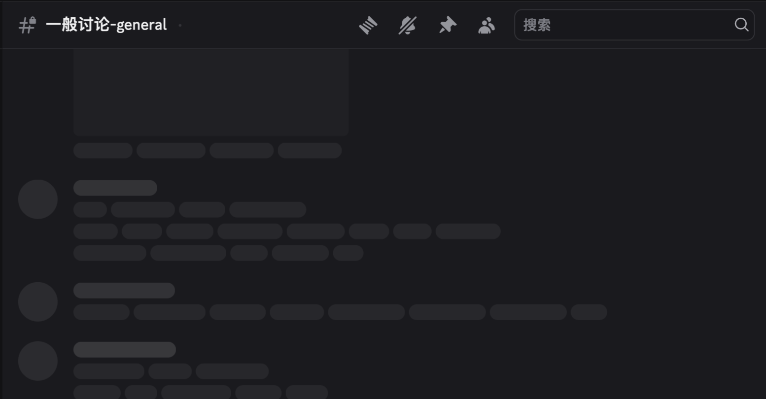 + This makes sense for English speakers. Thread can mean both things, a series of connected posts/chats or a long thin string you knit with. But for those who speak a different language, this can be very confusing. @@ -26,8 +26,8 @@ This is not the only case. In IntelliJ IDEA, a well-known Integrated Development The icon for external libraries looks like a bar chart, but it was meant to be three books of different sizes, meaning "library". In Chinese, a library in software context is called 库, meaning a warehouse, a storage unit, or a garage. It has nothing to do with books or actual libraries. {{< gallery >}} - - + + {{</ gallery >}} In Java, we call a well-encapsulated class a Bean, most likely referred to coffee beans since java is actually a kind of coffee. As you can see, the icon for Beans is actual coffee beans. Though we don't really have a translated name for Beans in Chinese,[^1] many programmers who are not familiar with the language don't think about real beans when they use the term, so it's hard to connect the dots. @@ -62,7 +62,7 @@ We can do all of that with icons. Let's take a look at GitHub's menu bar for example. - + Start from the right. The first icon is for "notifications", or "inbox" more accurately. The whole concept of "inbox" comes from real inbox trays in the office, where people put in files they need to process later. We **associate** the interface where we receive messages with a physical container, just like a real inbox tray. It's pretty intuitive that GitHub picked a inbox tray icon for notifications. If you want to find works that needs to be done, you go for the inbox tray. diff --git a/content/en/posts/take-ugly-notes-do-pretty-work.md b/content/en/posts/take-ugly-notes-do-pretty-work.md index 6a311ecd..3c653f03 100644 --- a/content/en/posts/take-ugly-notes-do-pretty-work.md +++ b/content/en/posts/take-ugly-notes-do-pretty-work.md @@ -9,7 +9,7 @@ toc: true I used to be obsessed with taking pretty notes. Here's my old Obsidian vault. And I haven't opened it for almost a year. -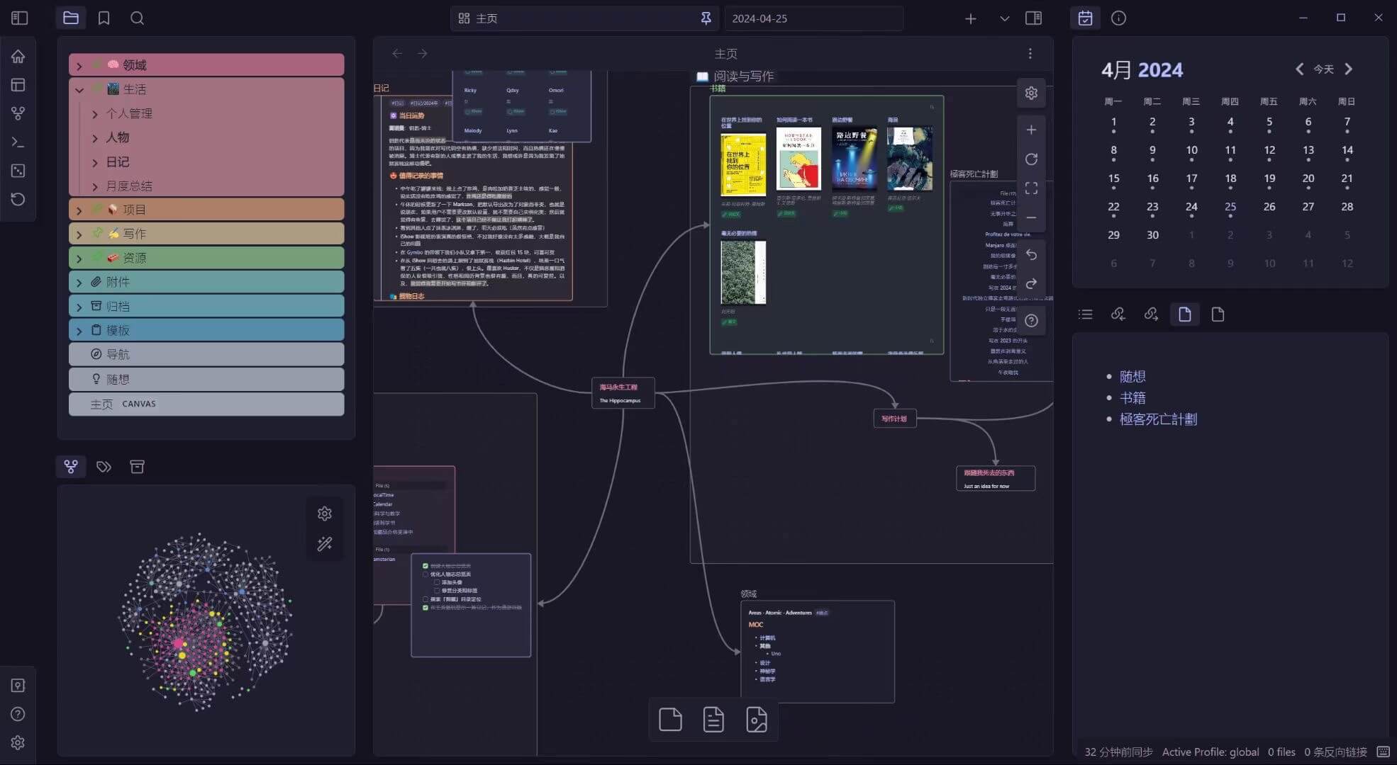 + The link graph is pretty, the whiteboard seems brilliant, and god, I even color-coded all my folders? And they got icons? They're so pretty that I don't even feel like I should put my dirty hands on it. |